Swiss View
Design, Reno & Build, Interior Styling; Condo; 2019
Moving from a breezy black-and-white bungalow to this private apartment concerned our clients because of the amount of space they would be giving up. They came to us asking for a space that would retain the best-loved features of their previous home: cross-ventilation throughout the home, bright and airy interiors, and a large kitchen conducive to everyday cooking and occasional entertaining.
This full-suite job had us first reworking the floor plan before working with our preferred contractor to execute the design vision. We gutted the kitchen and bathrooms, changed the flooring of the home, and also created extra storage throughout. It took us 11 months to complete this job.
Please scroll to the bottom for project notes.
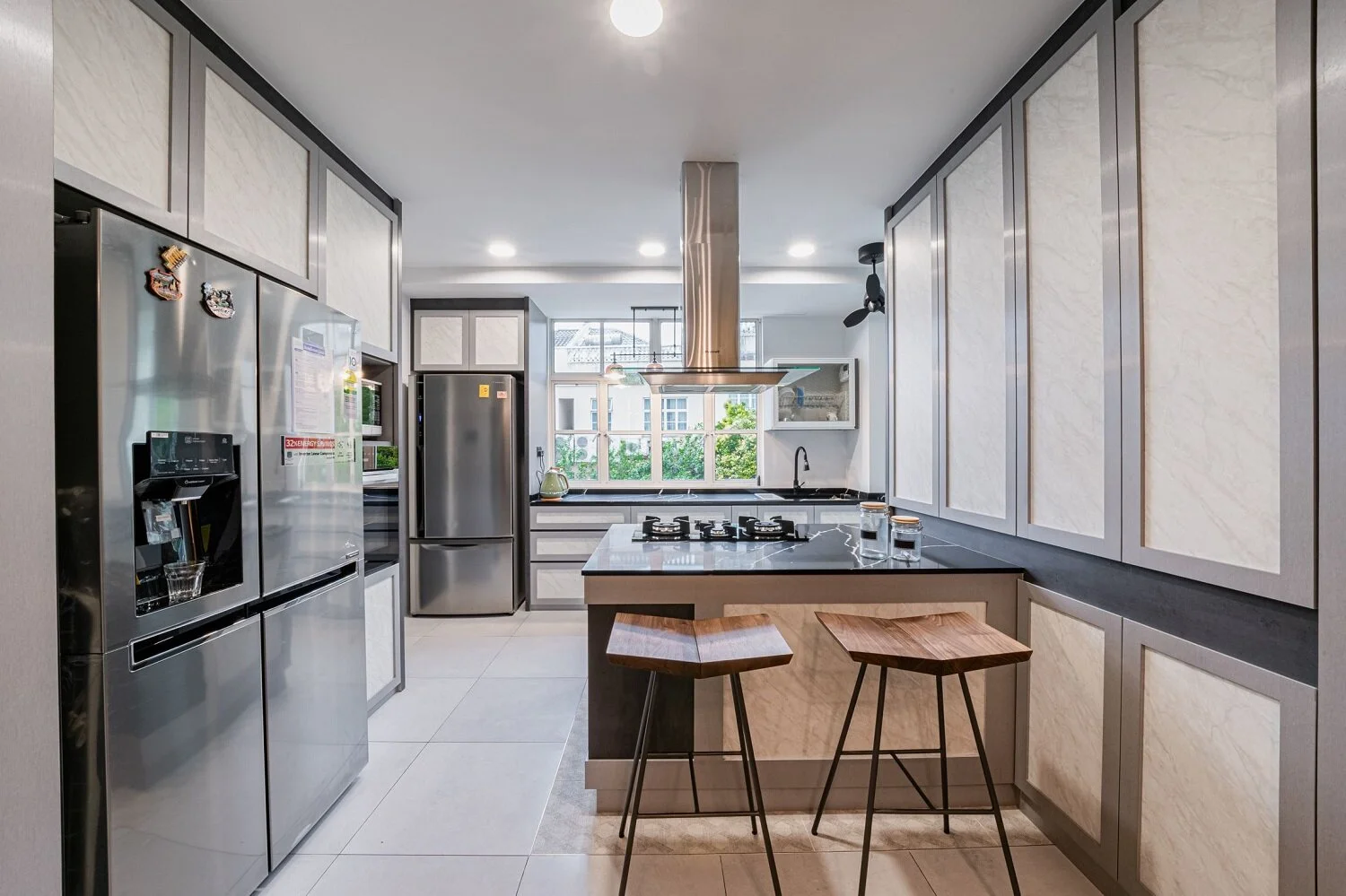
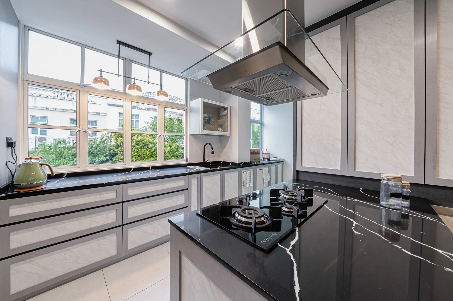
Kitchen
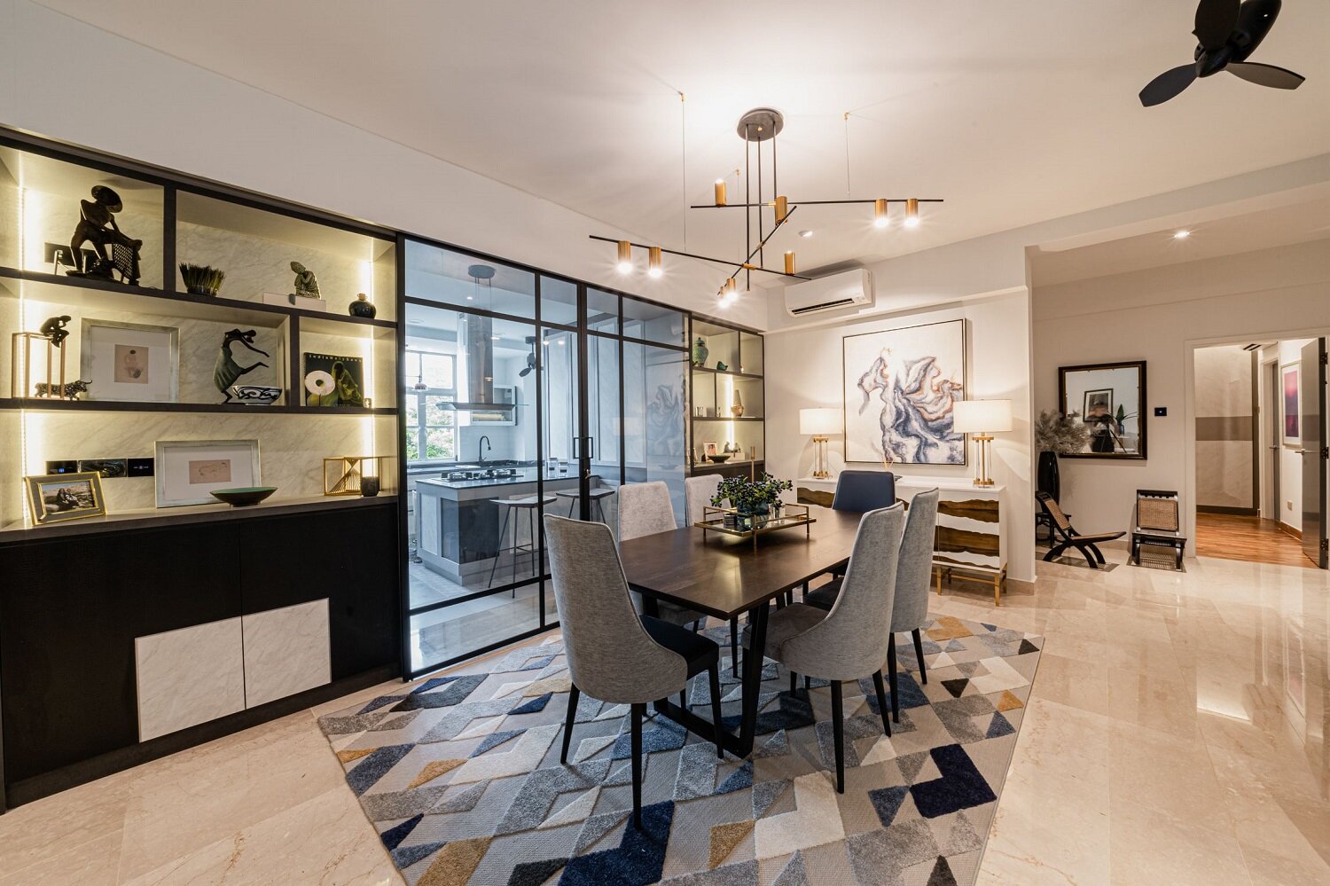
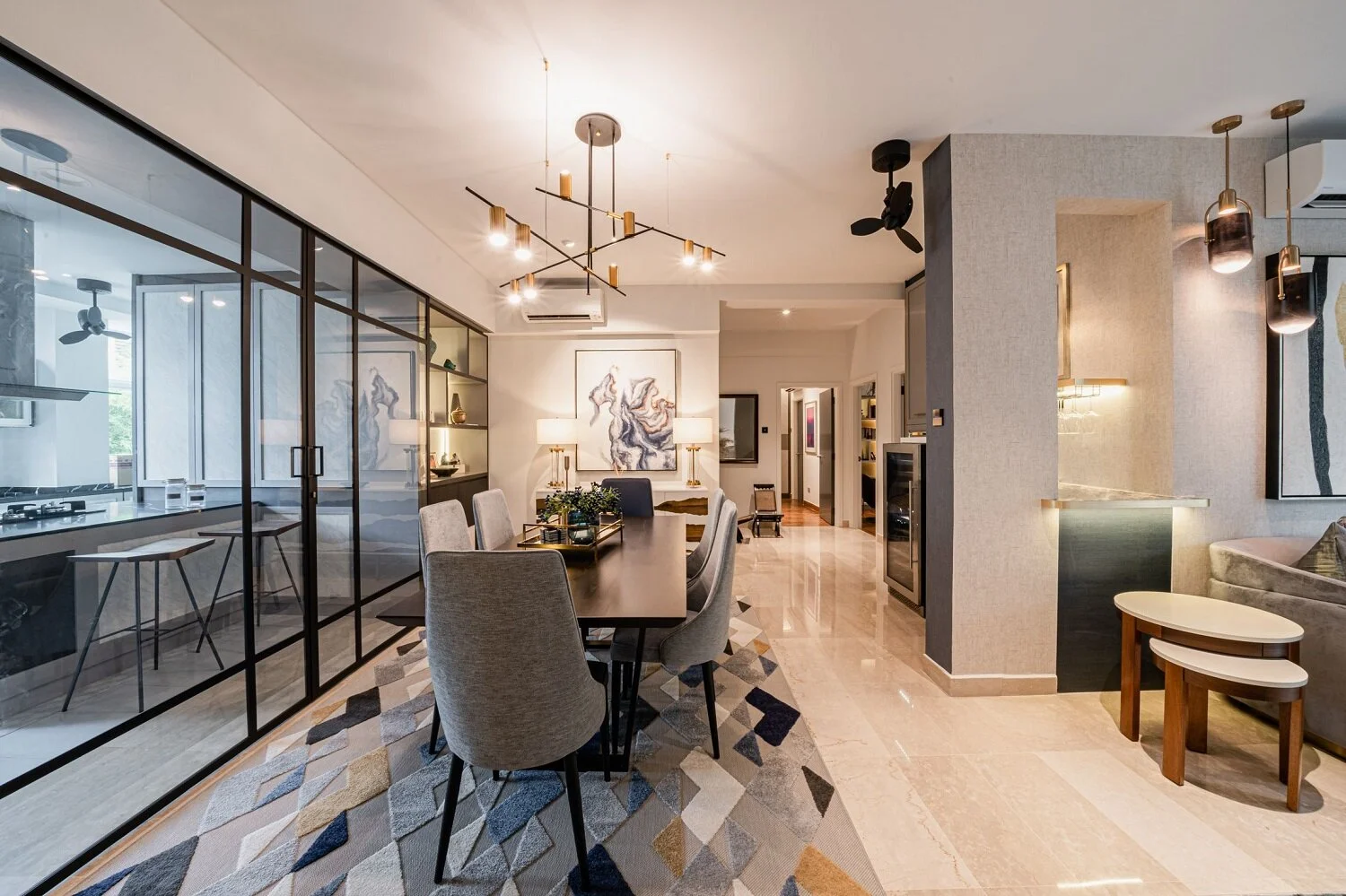
Total redesign and renovation of the kitchen area. We retiled the space and installed a new island, countertops, cabinetry, and appliances. Glass sliding doors were built for a seamless open/closed kitchen concept. To maximise functionality, the island counter can be pulled out for extra working or display space. Display units were also built to flank the entrance to the kitchen, both for functional storage and also as a focal décor point.
Living room
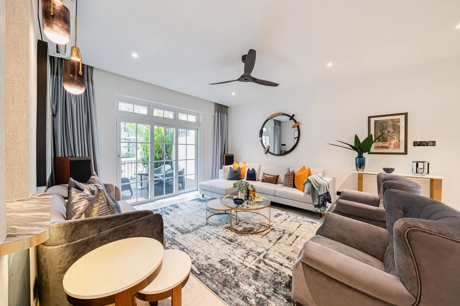
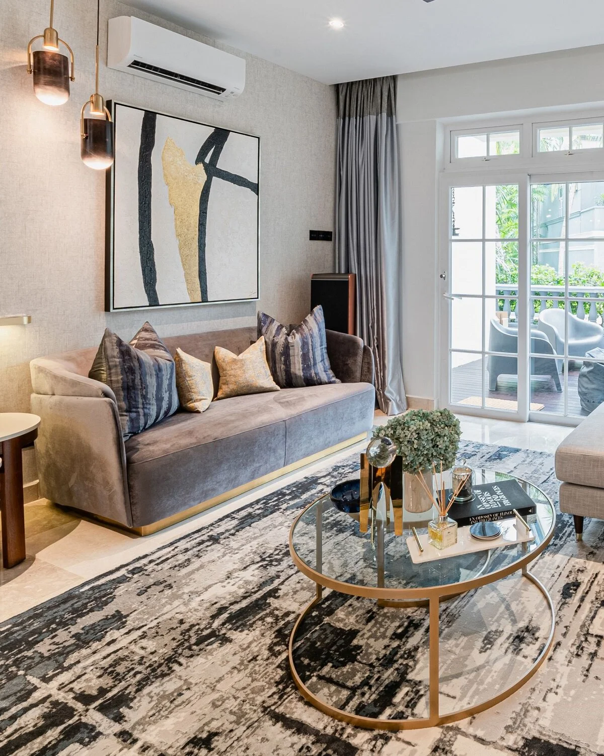
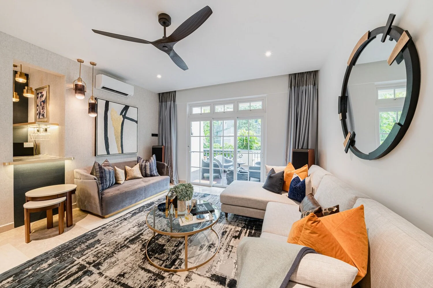
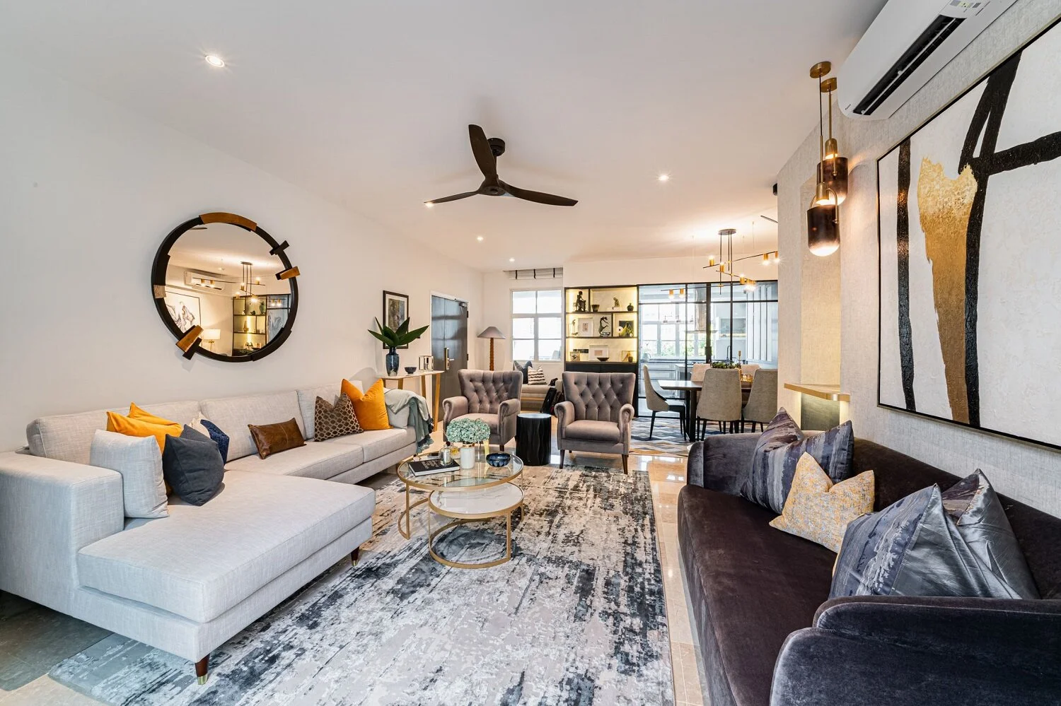
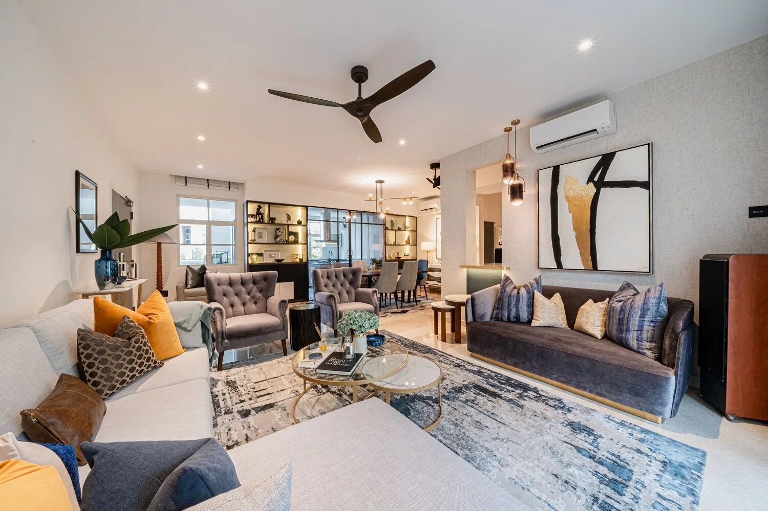
In the living room, we reworked the layout to allow for more natural light to come in, as well as to facilitate cross-ventilation in the common areas. We also designed and built a custom bar niche that would allow the clients, who enjoy bartending and entertaining, to fix up drinks for their guests and remain a part of the living room conversation.
Master bedroom and ensuite
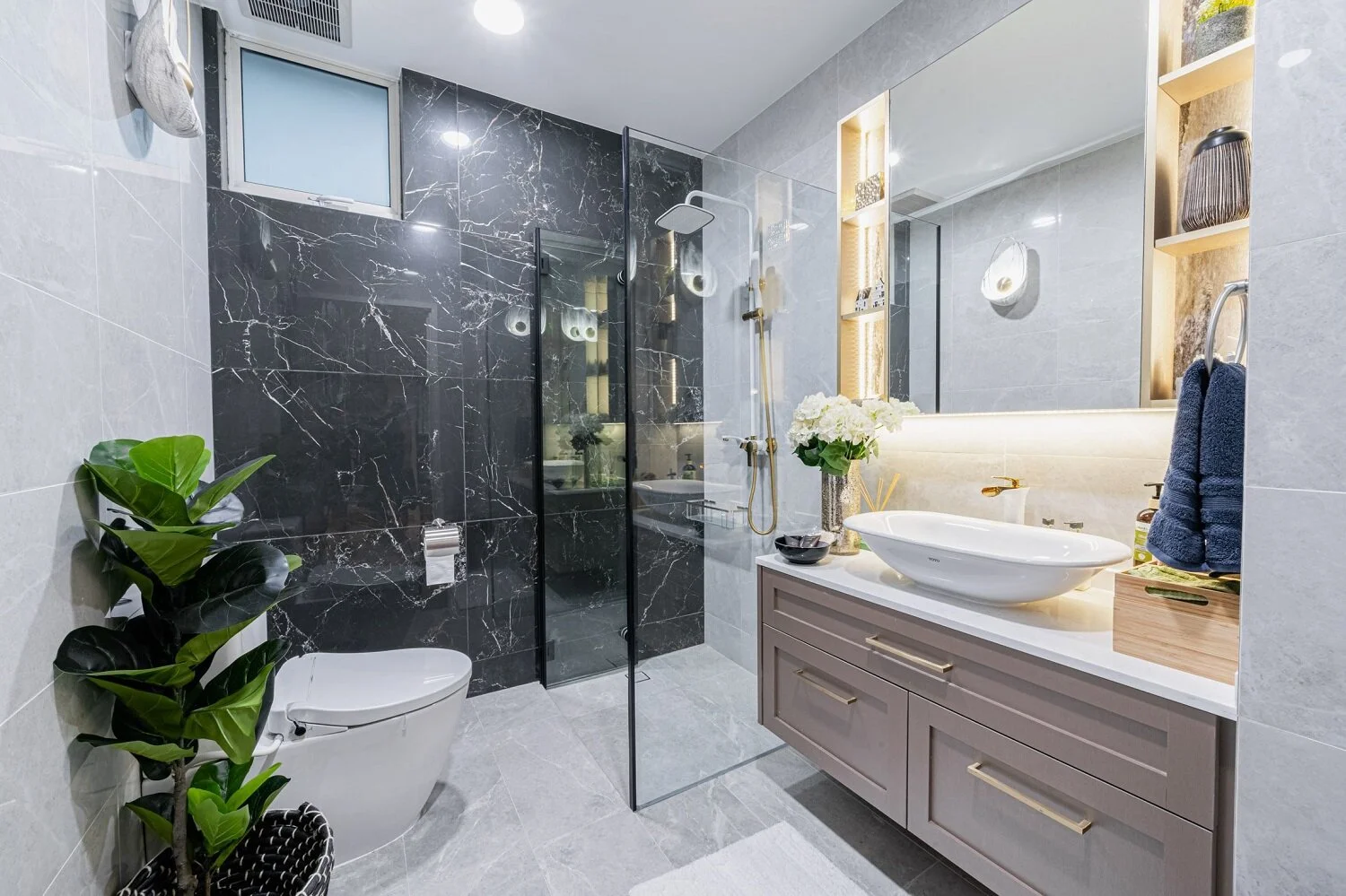
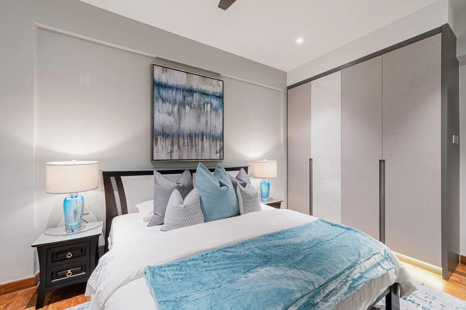
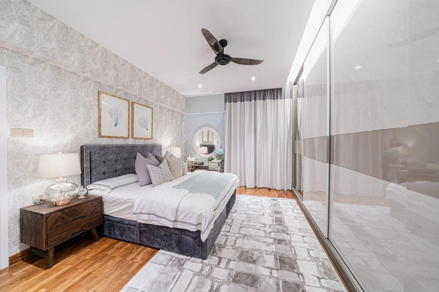
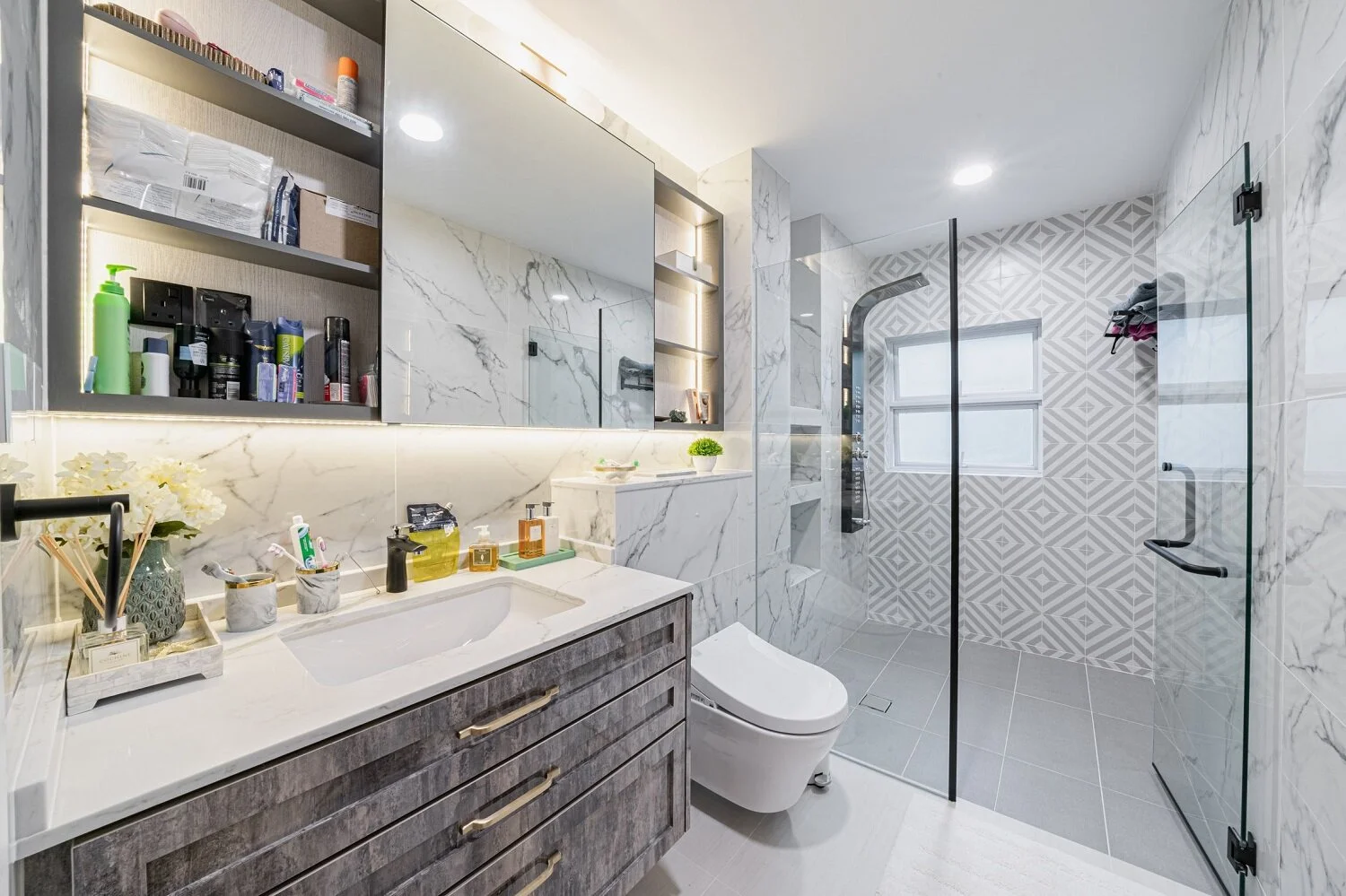
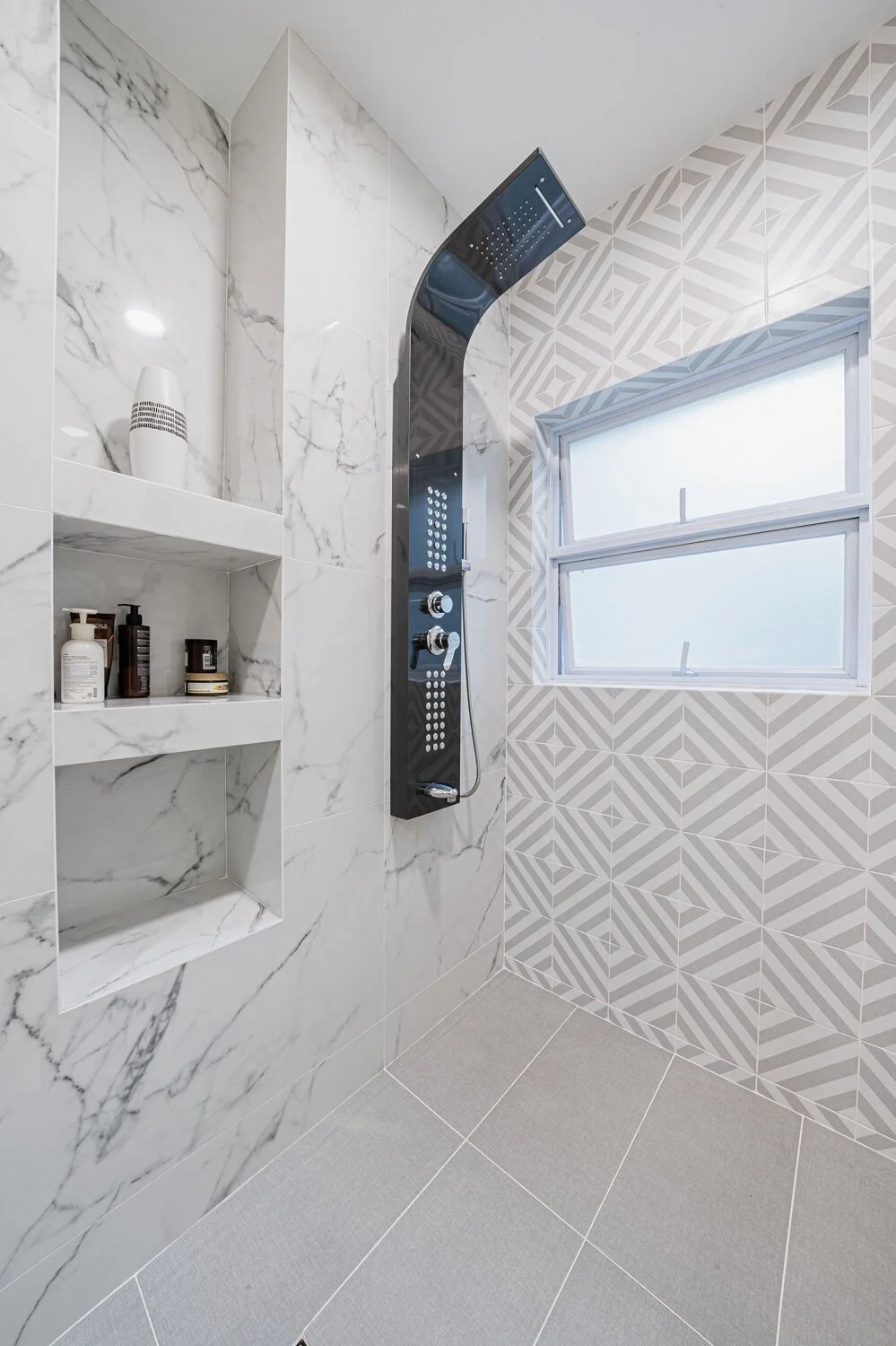
We redesigned the master bedroom and ensuite bathroom. We replaced the initial feature wall and dark wood closet doors with new finishes and wallpaper to create a tranquil, calming space. We also retiled the bathroom with a geometric feature wall, and replaced the tub with a more spacious shower and additional storage.
Guest bedroom
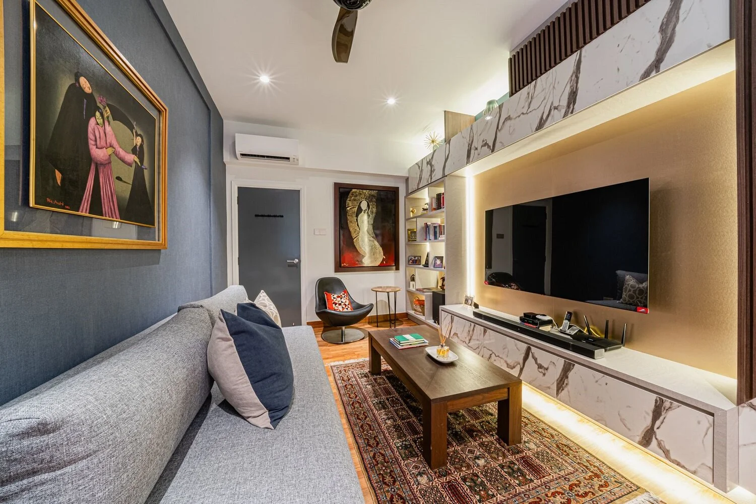
We designed one guest bedroom as a multi-functional media space and home office. The built-in media unit accommodates a wardrobe closet and a full-length mirror on the door to host guests if necessary.
Notes from our stylists
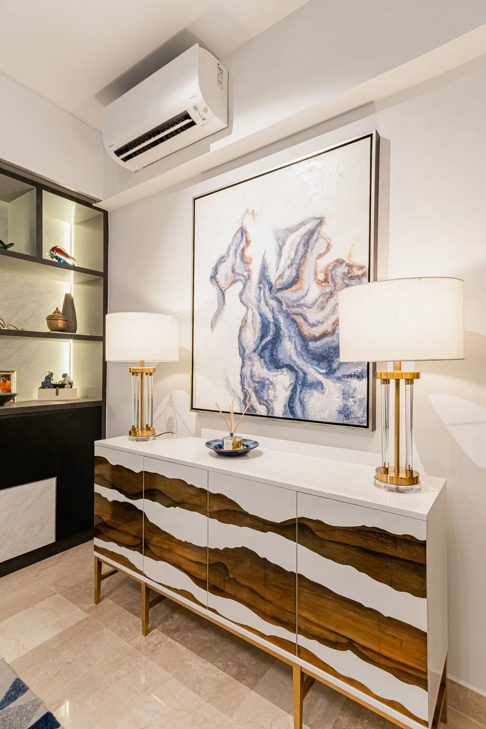
We used a restrained colour palette of blacks, whites, and greys, accented with gold for a more glamorous, gilded look. Common areas used more saturated tones while private bedrooms used more subdued tones.
We layered textures of wood, glass and metal to set the foundation for a contemporary but inviting space. Since the goal was to create a brighter home, we strategically employed mirrors, glossy laminates, metallic finishes, and glass for a visually lighter feel. Rugs and soft furnishings helped to temper these colder textures.
